Practically Perfect Children’s Rooms

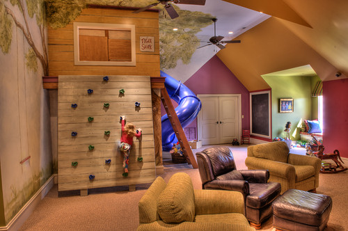
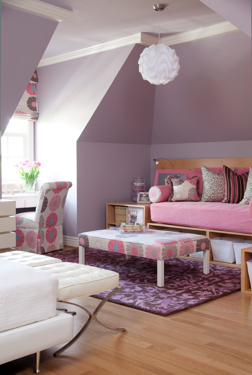
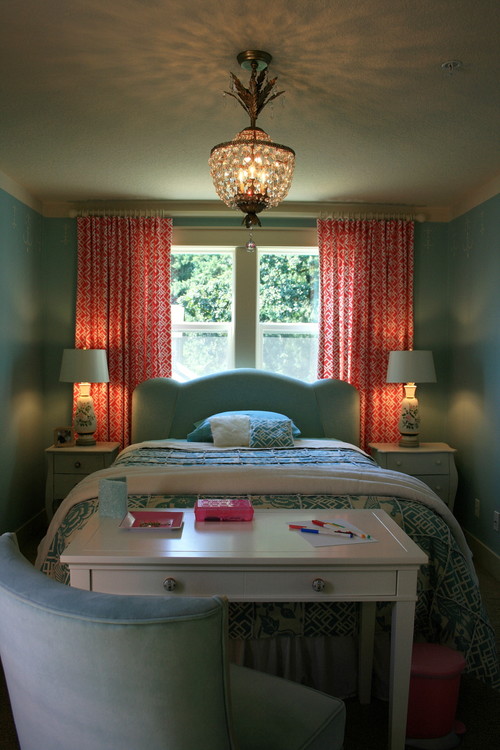
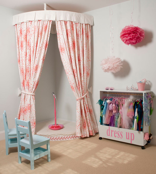
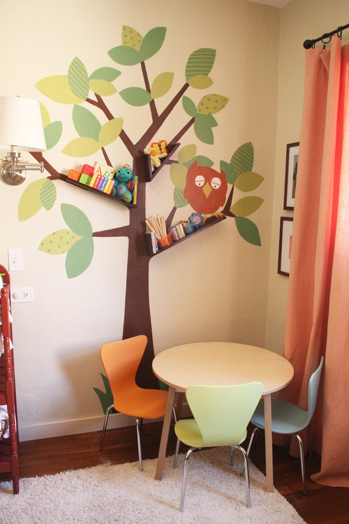
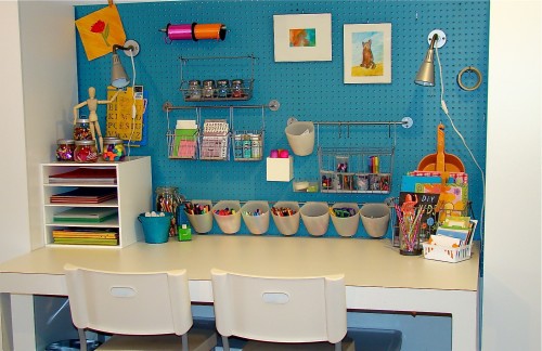
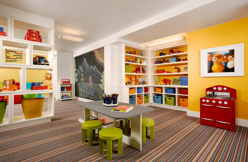
I’m always on the lookout for decorating inspiration for my children’s rooms. My girls spend a lot of time in their bedrooms and playroom, and I want their spaces to feel like happy, bright, creative, fun rooms for them. While I’m not really in the market for a total overhaul on their rooms, I do love some of these inspiration photos I found.

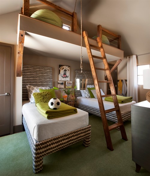
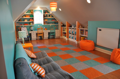
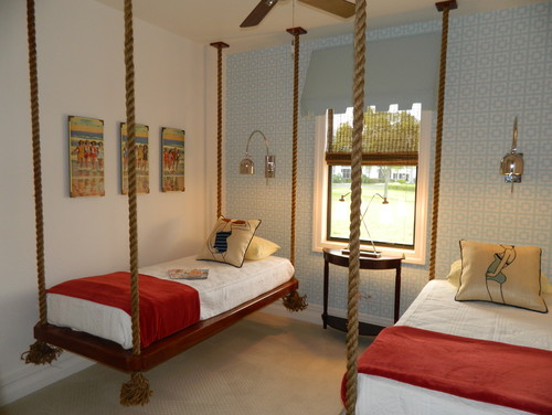
Traditional Kids by Aspen Architect Poss Architecture + Planning + Interior Design

The Magic of Chalk Paint

Furniture pieces painted with chalk paint are all the rage right now! I know you’ve seen them on Pinterest and your favorite decorating blogs. I’ve been really wanting to try chalk paint, as the colors I’ve seen in Annie Sloan chalk paint are simply gorgeous. When I came across some cans of ASCP at a sale for $5 per can (and $5 cans of wax to boot!) I knew my time had come. I snatched up three colors of paint and three cans of wax and decided to figure it out.

The beauty of chalk paint, or so I’d read, is that there is no need to sand or prime. Plus, you get a nice flat chalky finish on your piece that is really pretty. After using chalk paint on a few pieces, I’m happy to report that it really is all that it’s cracked up to be. I’m a big fan. Here are a few transformations I’ve been working on:

alt="chalk paint"

alt="chalk paint"

alt="chalk paint"

alt="chalk paint"

Now, chalk paint can be very expensive if purchased pre-made. However, I quickly learned how to make my own to save a bundle. You’ll need:

Whatever color of latex paint you want
A carton of plaster of paris (dry mix that comes in a carton. Available at Home Depot or Lowe’s.)
Water
A stirring spoon or old whisk you don’t mind getting paint on

I mixed about four parts paint with one part plaster of paris and thinned a little with the water. I used a plastic bowl to mix in, as there isn’t room to stir if your paint can is full and you add the plaster mix directly to it. Sometimes I needed the water, sometimes I didn’t. The paint will be a little thicker, which I liked for better coverage, but you can thin as much as you like. One word of caution, I think I used a little too much plaster in one can of paint because when I opened it this morning, it had set up right in the paint can. I was still able to mix water into it and get it back to a paint consistency, but it was a bit lumpy.

I painted two coats of chalk paint on each of the above items and then finished with a top coat of either wax or glaze. The green chairs and the duck egg blue table had clear wax applied to them. The turquoise coffee table was distressed with sanding paper and had a brown glaze applied. The three-drawer chest was ivory to begin with, then I painted with charcoal chalk paint, distressed with sandpaper, and applied a coat of clear wax.

There are so many ways you can use chalk paint that it really is its own art form. you can use more than one color, apply various top coats, and distress or not. The choices are all up to you!

The Family Dinner Table

It’s no secret that I love to cook. One reason is because my family loves to EAT. We just really, really love food. We love to try new dishes and we love to comfort ourselves with old favorites. But, I think one of the reasons we love the food culture so much is because food is a common bond that ties us all together. It’s the togetherness that we’re really after. That common thread that connects us to each other. The sense of community and belonging when we gather around the family dinner table with our favorite people to laugh, share, dream, explore, and remember.

You know, it’s the people you’re with who matter most. Not the food. Not the space. Not the topic of conversation. You can have intimate conversation while eating a peanut butter sandwich on a paper plate from the tailgate of your car. However, as the tender of our homes, it is nice to put a little effort into creating a space where our families feel at home, relaxed, and free to share. I want my home to be a place where people feel at peace, and so I try to make my home have that vibe. I shared with you all the place where my family eats most of our breakfasts and lunches – at the bar in our kitchen.

Bar

(Let’s all pretend that you can’t see dirty dishes in the sink and a floor that needs to be swept, mkay?)

This space has worked so well for us, as we spend LOTS of time in the kitchen. The girls can sit at the bar and do schoolwork, eat, talk with me while I cook, etc. However, the adjacent space, where we eat most of our night meals, is not quite as homey as I’d like it to be. I love the stripes that we painted several months ago, but they bring a busy-ness to the room that no longer works with all the busy-ness on the shelves and the busy-ness of artwork. It’s too busy. It’s just all TOO BUSY!!!

Dining

Anyhoo, this has sent me on a bender to find dining room inspiration. I want a space that doesn’t feel so chaotic so that my family can relax and be at peace while we eat. I thought you might like to see some of the beautiful rooms I found.

I ADORE the Spanish colonial style, and this space is perfect for gathering the family together! The chairs look comfy – encouraging people to linger and converse.

I’m not usually one to throw a contemporary space on you, but I think this room fits the bill perfectly. I can easily imagine having a few friends over for dinner and hanging out half the night in this space. It’s quite simplistic, but it just WORKS really well.

I’m coveting the light and brightness of this cottage space. I’m sure I could get lost in the view that is seen through those big windows. It’s relaxed and homey, but not too much so. There are still some formal elements like the chandelier and the artwork to give it some structure.

This home sits on a lake, so you know it’s always full of family and friends, fun and laughter. This dining room is perfect for entertaining a crowd. Love the size of the table.

When your artwork is done by the Master Creator, there is no need to add anything to the space. The simplicity of this room allows you to fully enjoy the view without interruption.

I happen to love the blues in this dining room. If blue isn’t your color, you have the freedom to choose your own color palate. But the thing I love about this room is the boldness the homeowners displayed in making it thier own. It definitely makes a statement.

6143ffc21dd0

Even with only a small space, this homeowner created a tidy, cozy dining space with only the basics: table and chairs. The choice of big artwork, natural shades, and plush rug make the space look complete.

d44e0f9476fb

Pluralizing Surnames on Christmas Cards

Every year I have the same grammar questions. They come around as I am addressing Christmas cards, and I bet you have the same questions. When I am addressing cards, instead of using a formal title like “Mr. and Mrs. John Jones” (especially when I want to include children’s names as well), I usually opt for a more casual “The Jones Family”. However, occasionally I like to go with “The Joneses,” but then that doesn’t look right, so I try “The Jones,” but that looks too singular. How do you use the plural form of surnames???

My go-to article to refresh my memory on proper grammatical pluralizing of surnames is found on Grammar Girl. In this article, Mignon Fogarty gives the down and dirty on this topic.

1. The most common way to change a family name to its plural form is to simply add an “s” to the end. The surname “Hill” becomes “Hills.”

2. For surnames ending in “s,” “x,” “z,” “ch,” and “sh” an “es” is added to the ending. So, “Jones” becomes “Joneses.” My maiden name “Mills” becomes “Millses.”

3. In all circumstances, you keep the base name the same, regardless of whether you would typically pluralize the word in another way. For instance, let’s look at “Chapman.” In everyday language, we would pluralize “man” by changing it to “men.” We ignore this rule when it comes to surnames and always keep the surname’s original form. Therefore, instead of changing it to “Chapmen,” you would use “Chapmans.”

4. Never, ever, ever use an apostrophe to pluralize a name. Apostrophes are ONLY used to show possession or to form a contraction. Therefore, the following are incorrect:
Let’s send a Christmas card to the Jones’.
I like to hear the Chapman’s sing.
The Mills’ are some of my favorite people.
Instead, you should say:
Let’s send a Christmas card to the Joneses.
I like to hear the Chapmans sing.
The Millses are some of my favorite people.
Should you, in fact, need to show possession to a plural surname, you would do it in the following way:
The Millses’ home is so lovely.
The Chapmans’ singing sounds like angels.
The Joneses’ card is in the mail.

Clear as mud?

Sincerely,
The Grammar Nerd

20121218-153653.jpg

GlassesUSA (Discount Code)

I have always sort of pshaw’ed at people who say things like, “It’s all downhill after 40.” It all sounded a bit dramatic to me.

Well.

I turned 40 a little over a year ago, and I finally see that a body does, in fact, begin a slow decline at around that age. Case in point: my eyesight. I went from 20/20 to blind as a bat OVERNUGHT. I have needed new eyeglasses for a while, but homeschooling two children, writing 10,000 words a week, running a house, and a host of other commitments have kept me from making my eyesight a priority. Sure, my reading glasses from the Piggly Wiggly are okay, but what I really need is to get myself a proper pair of glasses. Maybe that could be my new year’s resolution.

And y’all, I had no idea that the eyeglasses purchasing process had changed so much since I last bought them. The last time I bought glasses, I went to the eye doctor for my exam and prescription. Then I ran by the optometrist on the way home and paid an arm and a leg for frames. Now, it seems you can actually purchase glasses online!?!

image001

As it turns out, there are sites like GlassesUSA.com where you can purchase eyeglasses without leaving your home. All you do is see your eye doctor for an exam and new prescription. Then you go to GlassesUSA.com and choose the frames you like. Order them using your prescription, and they will be on their way to you.

And I don’t know if you’ve bought glasses lately, but they are high as a cat’s back! However, GlassesUSA.com has eyeglasses frames starting at $38, with tons of cute designer frames around the $100 price point. They carry frames by Coach, Guess, Lucky Brand, Lacoste, Tom Ford, and Bolle. In my humble opinion, they are much better than the frames you see in Target, but these are cheaper.

TryOn

I know that all sounds well and good, but you need to try on the glasses, right? Well, GlassesUSA.com has this incredible online virtual mirror feature where you can upload a picture of yourself and “try on” the frames.

GlassesUSA.com is offering a 15% discount on your entire order (over $50) plus FREE SHIPPING using code FS15. Readers may also take 10% off any prescription glasses order using code Blog10.

This post is sponsored by GlassesUSA.com, but all opinions are entirely my own.

And the winner is….

Thanks to all of you who entered our giveaway for a $50 gift card to the Shops of Grand River. Our winner was chosen at random by Rafflecopter.com and the lucky lady is…

#19 Karen Crichton.

Congrats, Karen. Hope you enjoy your shopping day at the Shops of Grand River!!

Can I Get A Vote?

I think my indecision in decorating choices has been well documented on this little blog. I become paralyzed in making the perfect choice, which leads to making no choice at all. Hence the reason that, although we renovated our kitchen a year ago, we still have no barstools. Some are too pricy. Some don’t fit the space. Some are the wrong style. Some are the wrong blah, blah, blah. I can come up with any number of reasons to put off making the decision.

So, I’m taking a big step and throwing a choice out there. I fully realize that by my taking a vote that I’m really putting the decision-making off on you, but work with me here, people. At least I’m ready to commit. Sort of.

My criteria are that they need to be compact enough to fit four stools without being cramped, I have to be able to afford four of them, they will be very close to a farmhouse table with (probably) windsor chairs, and my children have to be able to maneuver them by themselves.

So here is the space…

And here are the barstools…

I’m thinking about the stone colored ones between the olive green and the brick red ones.

What say you, internet friends? Do “we” like these? Have you seen other options?

Thanks for your input,
Stuck in Indecision

Gallery Walls

I’ve had a gallery wall in almost every home I’ve lived in. I love the cluttered, eclectic feeling of mixing lots of different paintings and/or photos together. But there are times I feel like my mix of pieces gets a little tired and I need a new way to arrange it. I went on a hunt for gallery wall inspiration, and there were some very nice ideas to be found!

Which Warby Parker’s Would You Choose?

In the last few years my eyesight has taken a bit of a plunge. I attribute it to the fact that I’m now 41 years old. I’ve always heard that it happens after 40, and I guess I’m right on time. I’m way past due for a visit to my eye doctor for new frames, so in order to limp by I ran to the Tar-Jay and bought a few pairs of readers. The more I’ve used them, the more dependent I have become on them. So it’s time to do something a little more permanent.

Enter the frames and the philanthropy of Warby Parker. They are to the eyeglasses industry what Tom’s are to the shoe industry. They believe glasses shouldn’t cost a fortune – so all their glasses are $95 – and they believe that everybody in the world deserves the chance to see – so they give away a pair for every pair they sell. (After helping the eye doctor on a mission trip, I can tell you first-hand how incredible it is to give someone a pair of glasses when they haven’t been able to see. Y’all, there is nothing like it!!) Though they do have a few stores nationwide, they are mainly an online company, so the way it works is that you select five pairs at a time to try on. They ship them to you postage paid, and then you return them postage paid. When you settle on a style you like, you send them your prescription and they send you the glasses you chose.

So here’s the deal. I hate making decisions about glasses. I never really know which ones look the best or even if any of them look good. Can y’all help a sister out? Here are the five frames I chose. Please leave me a comment telling me which ones I should order. Thanks bunches!

These are called FINN:

Finn

These are the PRESTONs:

Preston

And the NEDWINs:

Nedwin

Next is COLTON:

Colton

And finally REECE:

Reece

 So what say you? Is there a favorite? Ditch them all and start over? Thanks for the help, friends!

Our Kitchen Renovation

Friends, I know I have been promising you a reveal of our kitchen renovation for MONTHS!! I just couldn’t seem to get all the accessorizing done and curtains made and blah blah blah. But it’s as done now as it’s going to get for a while, so I’m ready to show it off. I thank you in advance for not thinking I’m being boastful about it. We’ve been in our house five years now, and while our other kitchen was functional and we were grateful to have it, it needed a little (ahem – a lot!!) of updating.

Let’s review what we started with…

Our home was built in 1981. (I believe the decorating is more from the 70’s than the 80’s however, hence the 1978 reference above!) We purchased it five years ago with the intent of renovating every nook and cranny. We have done a TON of work, but the kitchen had remained untouched until a few months ago. It’s a big, expensive project and we knew we needed to save our pennies and PLAN, PLAN, PLAN so that we didn’t make design mistakes. We only get one shot at this so we wanted to do it right the first time.

Functionally, it was a great space. The open concept was actually ahead of it’s time in 1981, and the abundance of cabinet space was, too. The black appliances are actually new. When we moved in, the appliances were a lovely shade of harvest gold. They all gave way during the first year we lived here, so they were all switched out.

This little desk area works well as a storage spot for purses, bills, mail, invitations, etc. But it had this weird overhang that we didn’t really know what to do with. And while we loved the storage above it, it was always a mess. No amount of organizing seemed to keep it tidy.

And the materials used in our space, while I’m sure were avant garde in 1981, are definitely NOT in 2012.

We kept the functionality pretty much the same. As I said, it worked well for a bustling family who spends as much time in the kitchen as we do.

Are you ready to see how it turned out?

Close your eyes.

1-2-3 OPEN!!!!!

Of course, the most dramatic change was the color of the cabinets. I looked at so many options, but I kept coming back to white upper cabs with a turquoise color on the bottoms. I have to admit, I fall in love with this room all over again every time I walk into it. It is the most cheerful and happy room in our home – as well it should be. We spend lots of happy hours in here.

We took out the soffits around the top of the cabinets and raised them to the ceiling. This not only gave us a ton of extra storage space, but it made our ceilings look higher!

New lighting was a huge part of this project. We removed the overhead fluorescent fixture and added recessed lighting in the ceiling. The outdated track lighting was removed and we installed two lovely pendants. Under-cabinet lighting went all around to serve as task lighting. It has made a world of difference, as I can see what I’m doing!!

The desk space stays much neater now that we closed in the cabinets and added the baskets. That odd space became a handy shelf for my cookbooks.

Our contractor even had the bright idea to put our plugs up high under the cabinets so that they didn’t interrupt the look of the subway tile. It looks so crisp and clean without a plug every two feet, even though they are really there.

I opened up these cabinets because I adore the look of open shelves in a kitchen. I store my dishes here because they usually stay pretty tidy. The white dishes are the everyday dinnerware we got when we married. I added the colorful bowls from Anthropologie. The green Emile Henry baker came from Williams-Sonoma and it was also a wedding gift.

The shelf flanking the other side of the sink holds more of our casual dinnerware, as well as our glasses and more cookbooks. They green mixing bowl is a treasured gift from my mom. It was my grandmother’s mixing bowl, so it holds a very special place in my heart and in my kitchen.

My big girl made this print in VBS this year, and I loved it so much I framed it and put it on my desk. It’s a wonderful reminder that even the young ones can be an example to us adults when they have Christ-like character. And we older folks should show them the respect they deserve for it!

We chose oil-rubbed bronze as the finish on the faucet, cabinet knobs, and drawer pulls. I like how they look against the colorful cabinets, and they do not show fingerprints. Yay!

And we opted for an over-sized, single bowl, undermount sink. I don’t miss the shallow double bowl sink at all. This sink can hold a dishwasher load of dishes and you can never even see them. Not that I would know, of course, because my dishes always go right into the dishwasher and are NEVER stacked in the sink. Ahem.

So that’s where we spend the majority of our days. We had happy days in our old kitchen, and we’ve had even more happy ones in the new kitchen. The most special thing about this space is the people who I share it with. It serves as a space to prepare food with love for my littles and their daddy and our dear family and friends. Old or new, if your kitchen can do that, then it’s a glorious place!

Linking up to:
Home Stories A to Z
Cheerios and Latte
Uncommonly Yours
Collage Friday
Tuesday Time Out
Savvy Southern Style